Friday, 12 December 2008
Pliminary Task...College Magazine

Thursday, 11 December 2008
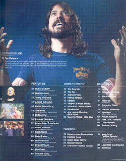
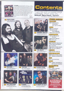
Clash Contents Vs NME Contents


If you compare Clash to NME you can see the target audience’s difference with Clash bright colours and numerous images do not attract their audience. Whereas NME’s contents page resembles a collage. It looks like as if it’s been cut and glued together, which I feel is very attractive but this magazine is aimed at people my age.
Analysing Contents Pages

 This contents page has many images, they are constructed in an organised way, however you can see that the intended readers are for a younger audience of around the ages 15 to late teenage years/early twenties. The style is very simple and effective.
Kerrang has used a simple font with black writing, the subtitles are written in yellow writing and have a black rectangle around it, and this is so that it stands out. The style of the contents page does support the style of the front page. As you can see the only colours used on the front cover are white, black, red, and yellow, the fonts are also simple. Although red is a colour used quite a few times on the cover the only red colour features is on the subscription, this maybe so that the subscription stands out more so more people will recognise this and begin subscribing magazines.
The information for the contents page is much organised, so that it is very easy for the readership to access the magazine. The magazine is sectioned in to different topics, which are: feedback, news, live reviews, features, K! icons, album reviews, gigs, swag and lastly famous last words. So if I wanted to see the gigs happening I would know that I would have to go to page 61. This tells me that the magazine is thinking about the accessibility of the magazine to the costumers and has made it easy for them.
Kerrang promotes subscription magazines. So costumers can get their magazines delivered to the house for a certain price per month.
The logo on the contents is not dominant as the front cover; this is because it is not even included on the contents page this may be because the editors may feel that it is not needed on the contents because the audience should already know what magazine they are reading because it is made clear on the front cover.
The Evolution Of Britney Spears...Part 3

The image of Britney has been cropped in a close shot of Britney’s face. This is so that her emotions are clear by her facial expressions.
Britney wants the readership to feel sympathetic for her. Her expressions show her emotions and the audience can tell that she is not happy. This is supported by the anchorage text because it states inside an American tragedy, and this tells the audience that Britney is going through an emotional time, this brings the readers in more.
The Evolution Of Britney Spears...Part 2

Britney is wearing just only underwear, comparing this pose and costume to her previous there is a very big difference. This image of Britney is very sexual and playful. The relationship Britney wants may be quite sexual. She may want the readership to see her as a sex symbol. This may have been leaded on from Britney’s first feature in Rolling Stones where Britney was not seen in a sexual way but in a teasing way, where to now she is seen sexually. As Rolling Stones is mainly being purchased by men aged 25 to 54, she maybe featured in this magazine to make her audience go from teenagers to people aged 54, so Britney also might be widening her audience.
The setting used is two white walls they look as if they are slyly closing in on Britney. I feel that the setting and the connotations are contrasting because the settings to me resemble purity however if you was to compare it to Britney’s costume and pose, the emotions for me are confused. Maybe like Britney.
High key lighting is used so it makes Britney stand out in an angelic way, as if Britney is saying to the readers come into the light.
The only colours being used are white, white is a colour of purity and innocence, this may be so that the audience may see Britney in a sexual way but may see her in as a ‘good girl’.
The Evolution Of Brtiney Spears...Part 1

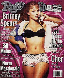
Britney’s costume is teasing the readers. Members of the audience may have different readings of this image. Some may find it quite provocative, particularly the male readers. She is wearing pink and polka dot black knickers which is not really appealing in a sexual way; if she was intending to come across sexy she would have worn a different type of underwear. The polka dot connotes femininity and playfulness. She is wearing a school shirt with it open so her chest is on show. This image to me comes across as a rebellious school girl. This image may appeal to young adults/older teenagers. This is also an intertextual reference to her fist music video which was also controversial. In the video her shirt is buttoned up but here it seems to have been ripped open.
For this image the props that are being used are a telephone and a teddy bear. The teddy bear is still showing that she is a young girl at heart, every little girl has a teddy bear in her bedroom and Britney is just like that. The telephone is conveying that she is like another teenager, she still likes to talk on the phone and have her little bit of gossip. This is a very stereotypical idea about teenage girls. There are a lot of contradictions in this image.
The setting used is a bed which is covered in silk, which is quite a luxurious material. Britney is lying down on the bed and us as the audience are looking down on her, which her looks vulnerable and the readership dominant. This is teasing the readers.
The colours being used are pink, black and white are feminine colours, pink is mainly being used which is the most feminine colour. This image was used to create media attention as she is only 17.
Tuesday, 9 December 2008
Magazine Front Cover Analysis...Vibe Vixen

Magazine Front Cover Analysis...Kerrang

The anchorage text tells the audience that this magazine has My Chemical Romance as their main feature. “They’re not okay “relies on the readership to understand that this is a title of their song. It gives the reader a sense of belonging.
The ISBN; it also shows the issue number of the magazine and the price and date. The price of this magazine is £1.99. This price is good considering that it is in the price range that their audience can afford teenagers are able to afford it and feel they are getting a lot out of it.
The editors have used buzz wordS. With the use of the word plus it makes the reader feel they are getting more of their moneys worth. It also informs the readership what artists are featuring in the magazine. Here also shows that this magazine is appealing to the whole of its readerships by including many different artists e.g. Public Enemy a hip hop artist. This is a regular feature on the magazine.
Free posters are one of Kerrang!’s main sells. The free posters are targeted to the readers who will take these posters and stick it on their wall. Also by writing ‘free’ it makes reader feel that they are getting their moneys worth. The posters are one of their promotions.
The bar at the top of the top of the magazine is giving information on what is going to be featured in the magazine. A puff has been added they have played about with the word exclusive and has changed it into eggsclusive. I think this is a really good affect for the regular costumers because they assume that they would understand their use of language. It is a pun because Sharon Osbourne threw eggs at Iron Maiden.