
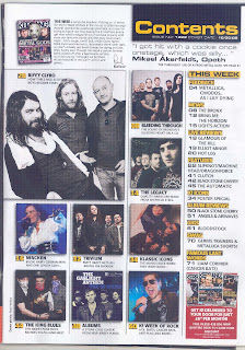
 This contents page has many images, they are constructed in an organised way, however you can see that the intended readers are for a younger audience of around the ages 15 to late teenage years/early twenties. The style is very simple and effective.
Kerrang has used a simple font with black writing, the subtitles are written in yellow writing and have a black rectangle around it, and this is so that it stands out. The style of the contents page does support the style of the front page. As you can see the only colours used on the front cover are white, black, red, and yellow, the fonts are also simple. Although red is a colour used quite a few times on the cover the only red colour features is on the subscription, this maybe so that the subscription stands out more so more people will recognise this and begin subscribing magazines.
The information for the contents page is much organised, so that it is very easy for the readership to access the magazine. The magazine is sectioned in to different topics, which are: feedback, news, live reviews, features, K! icons, album reviews, gigs, swag and lastly famous last words. So if I wanted to see the gigs happening I would know that I would have to go to page 61. This tells me that the magazine is thinking about the accessibility of the magazine to the costumers and has made it easy for them.
Kerrang promotes subscription magazines. So costumers can get their magazines delivered to the house for a certain price per month.
The logo on the contents is not dominant as the front cover; this is because it is not even included on the contents page this may be because the editors may feel that it is not needed on the contents because the audience should already know what magazine they are reading because it is made clear on the front cover.
No comments:
Post a Comment