
The layout of the Clash contents page is very simple it does not include as many images as Kerrang’s contents/ NME contents. Just by the first glance of the contents page you can tell that this is for a much sophisticated audience, preferably city workers. The less use of images and very simple colours used gives this away. Clash’s contents page to me resembles a newspaper, with the columns etc.
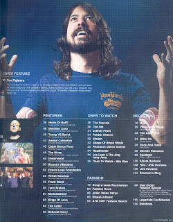
If you compare Clash to NME you can see the target audience’s difference with Clash bright colours and numerous images do not attract their audience. Whereas NME’s contents page resembles a collage. It looks like as if it’s been cut and glued together, which I feel is very attractive but this magazine is aimed at people my age.
If you compare Clash to NME you can see the target audience’s difference with Clash bright colours and numerous images do not attract their audience. Whereas NME’s contents page resembles a collage. It looks like as if it’s been cut and glued together, which I feel is very attractive but this magazine is aimed at people my age.
No comments:
Post a Comment